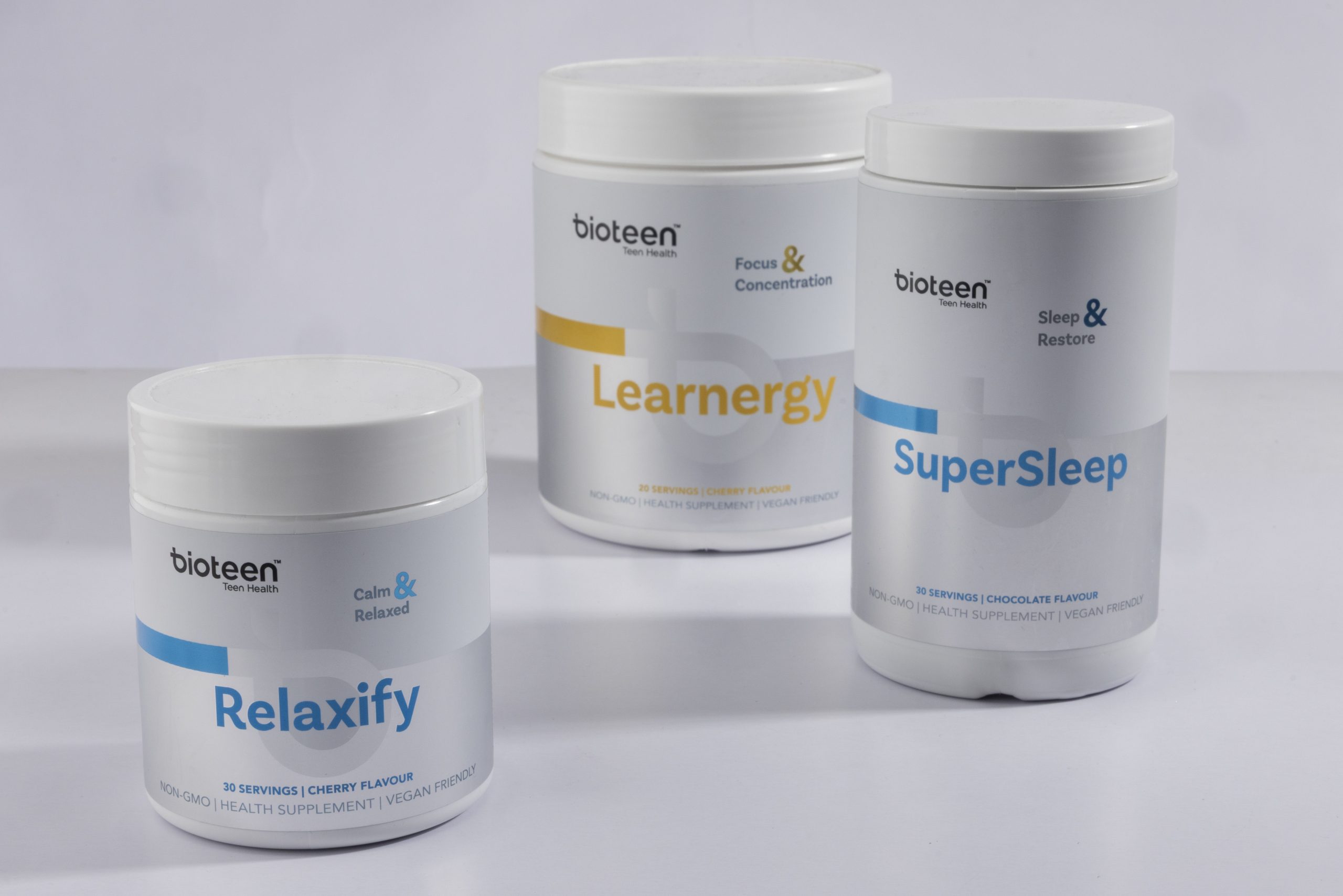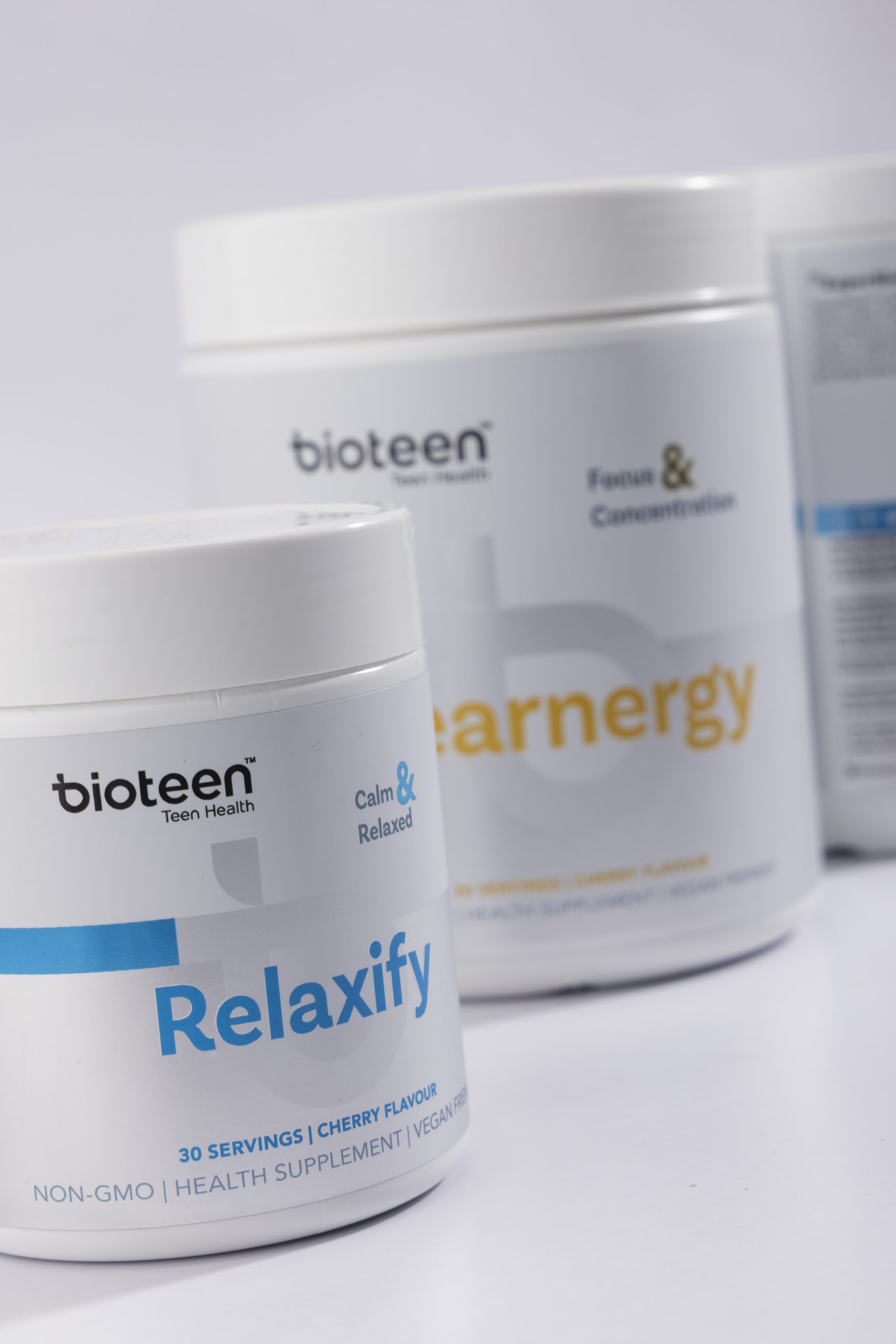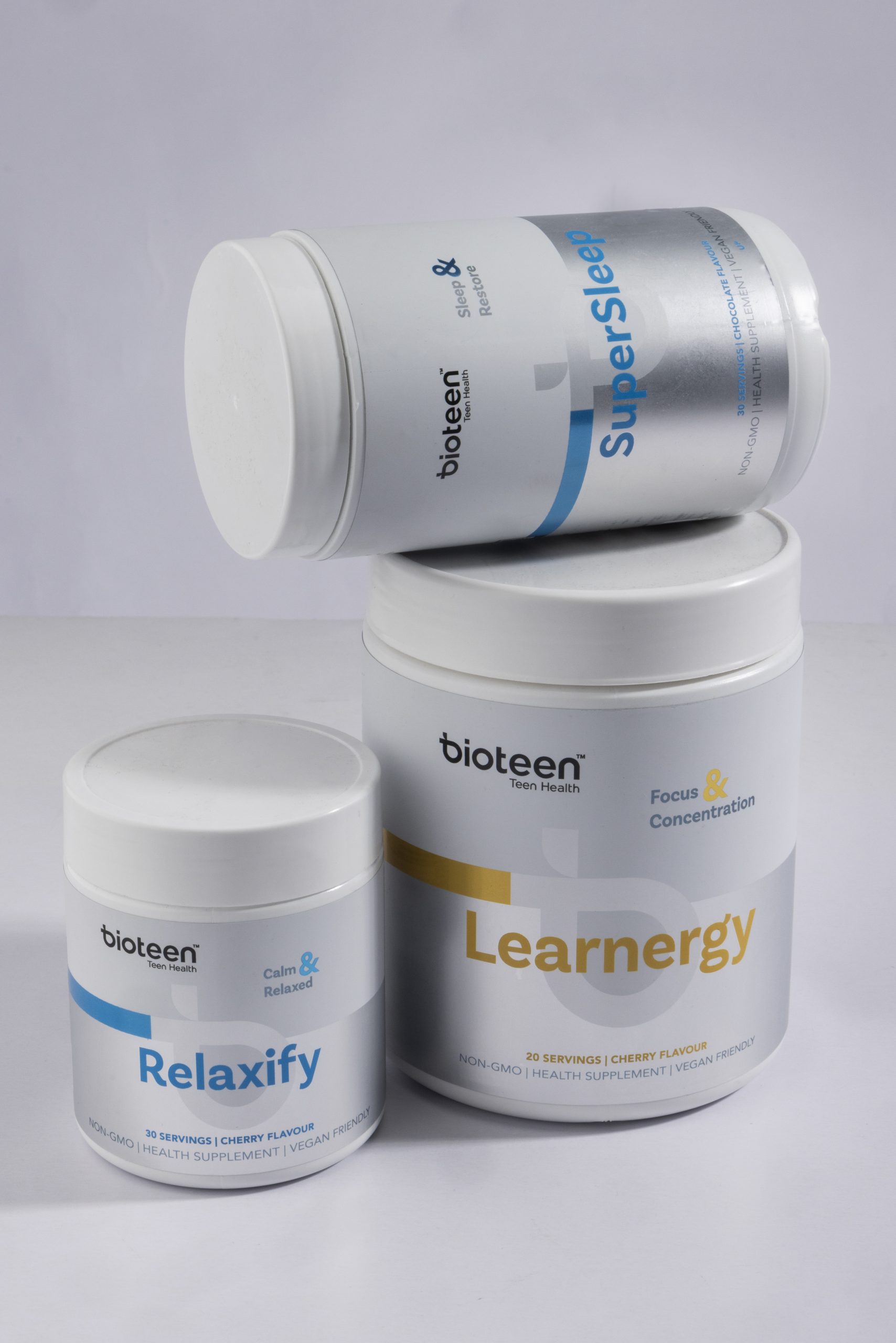
When Bioteen set out to refine its identity in the teen wellness space, the goal was clear: build a packaging system that reflects the clarity and focus the brand promotes. As a range of science-backed nutritional supplements formulated specifically for teen health, Bioteen needed a look that felt fresh, trustworthy, and age-appropriate—without the gimmicks. Bioteen packaging design—including Relaxify, Learnergy, and SuperSleep—strikes a balance between clinical credibility and emotional warmth. Each pack features:
-
A crisp white base that signals purity and health
-
Vibrant accent colours to differentiate benefits and aid product navigation:
-
Relaxify → calming blue
-
Learnergy → energising yellow
-
SuperSleep → tranquil turquoise
-
-
Minimalist layout with clear hierarchy, making it easy to understand benefits at a glance
-
Soft rounded type and colour blocks that add friendliness to an otherwise clean, clinical space
The final design is a fresh-faced, credible wellness identity that makes health support for teens feel not only accessible, but aspirational.
For more information on the Bioteen Range. Click here.


