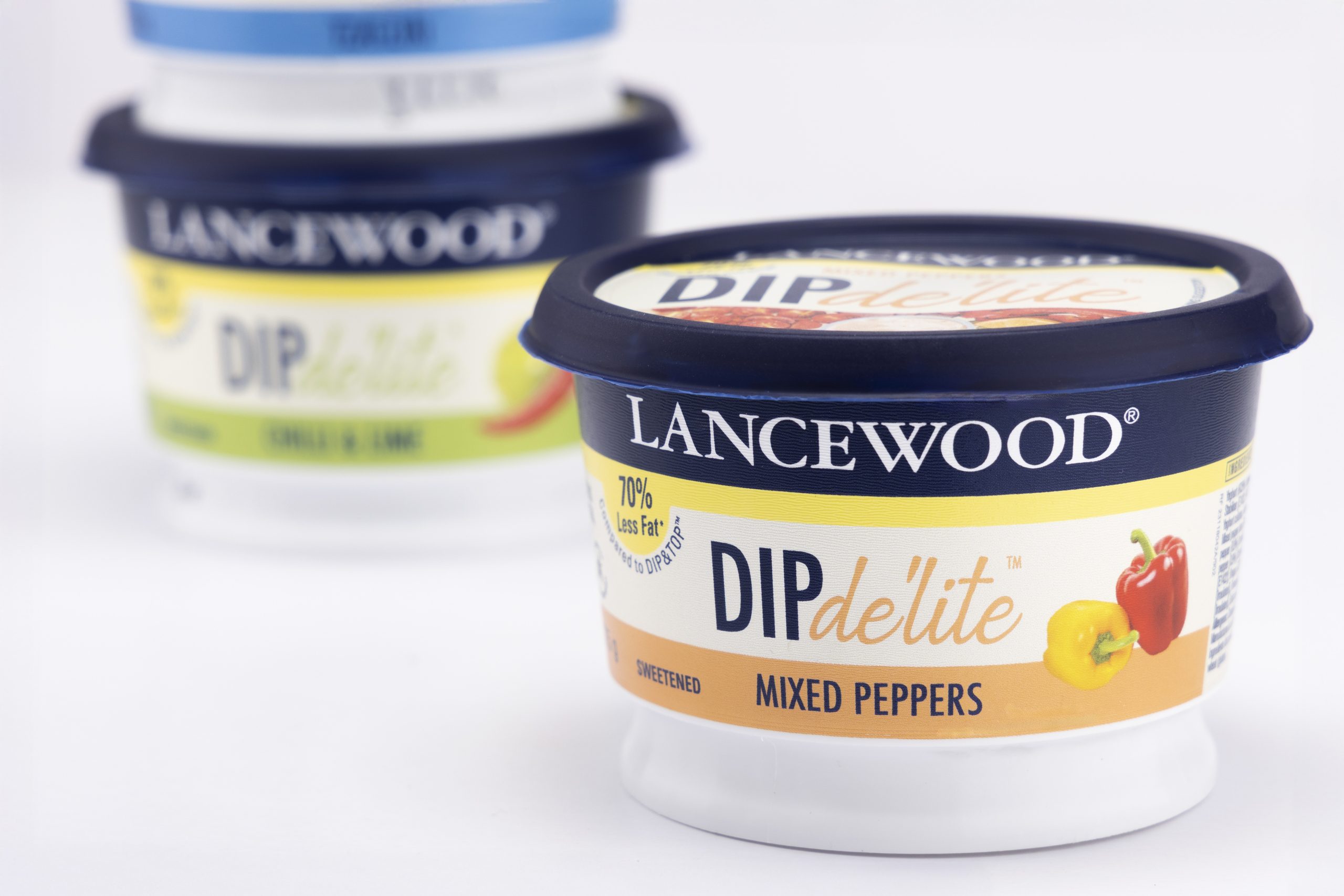
How smart packaging design helped a household dairy brand make a fresh statement in the dips category.
When Lancewood, a trusted name in South African dairy, expanded into the chilled dips category, they partnered with Bravo Design to create packaging for the new DIP de’lite range—aimed at health-conscious, flavour-loving consumers. The result? A packaging system that is as bold and contemporary as it is clean and easy to shop.
Designing for Clarity and Craveability
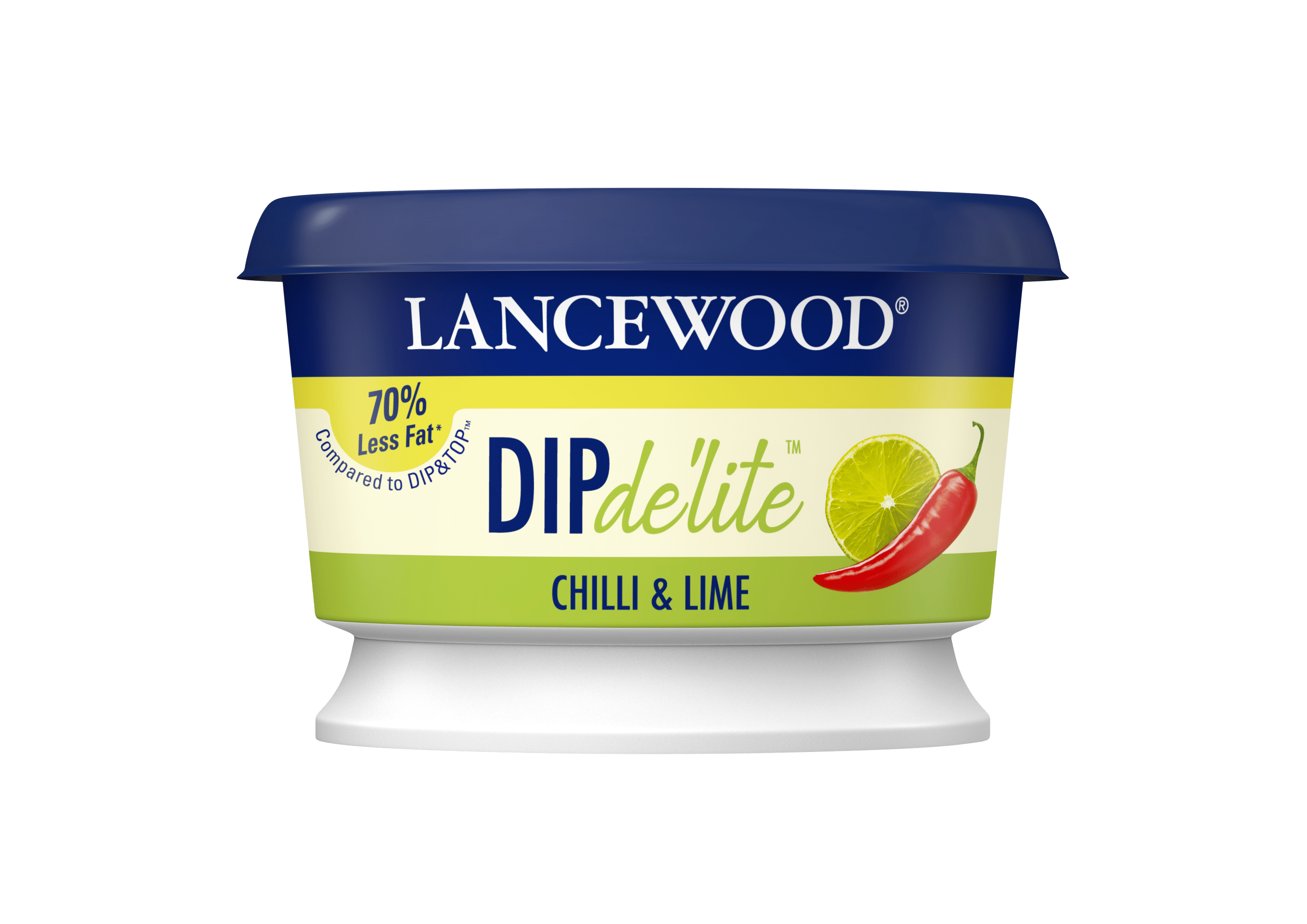
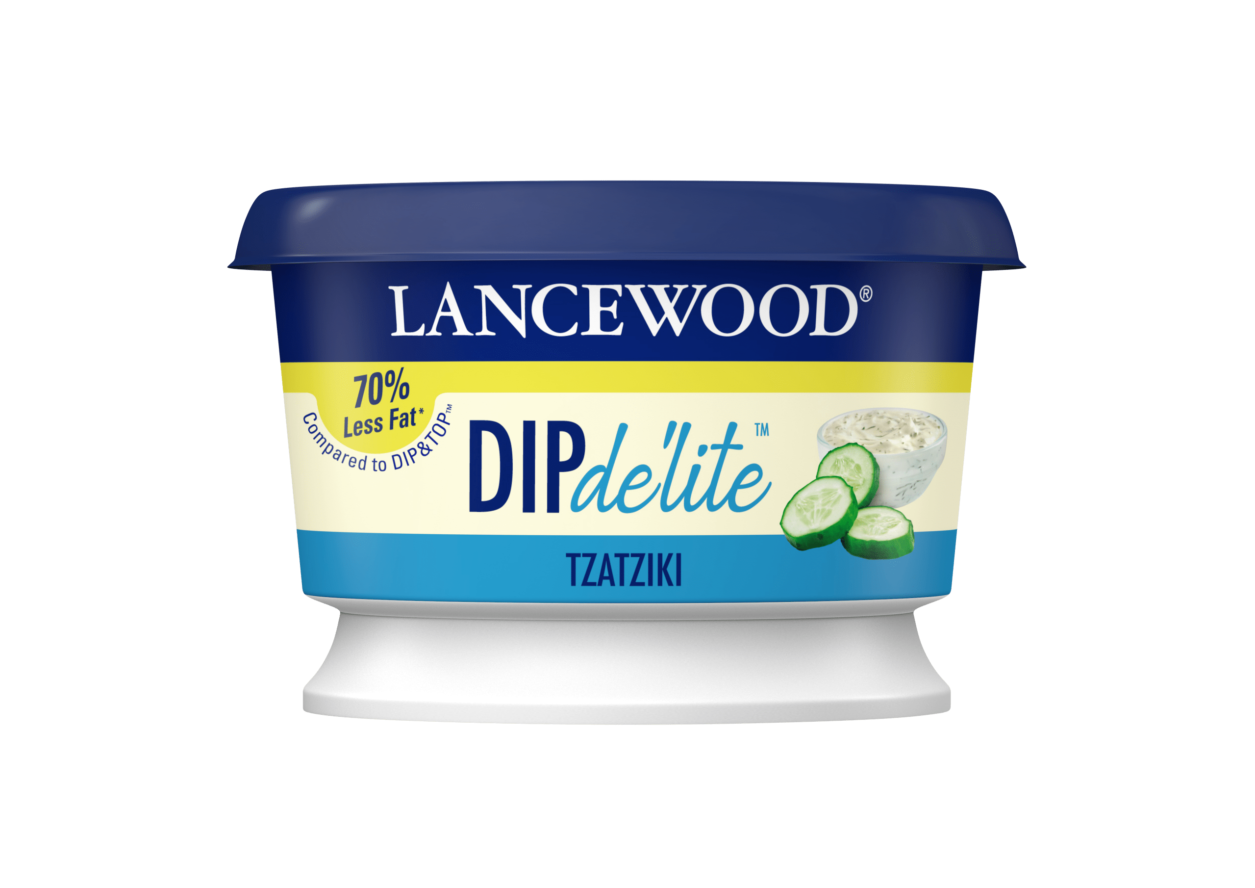
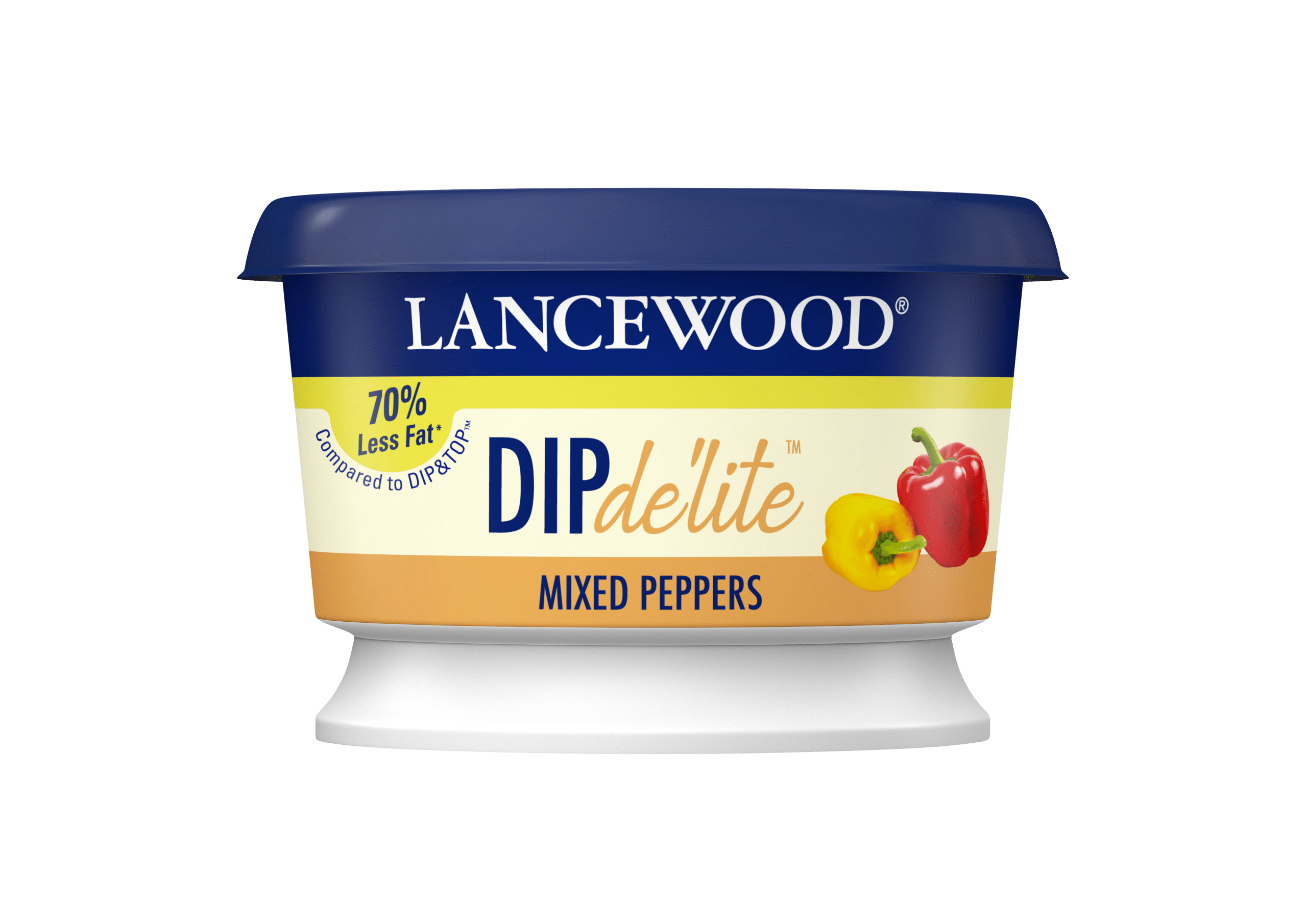
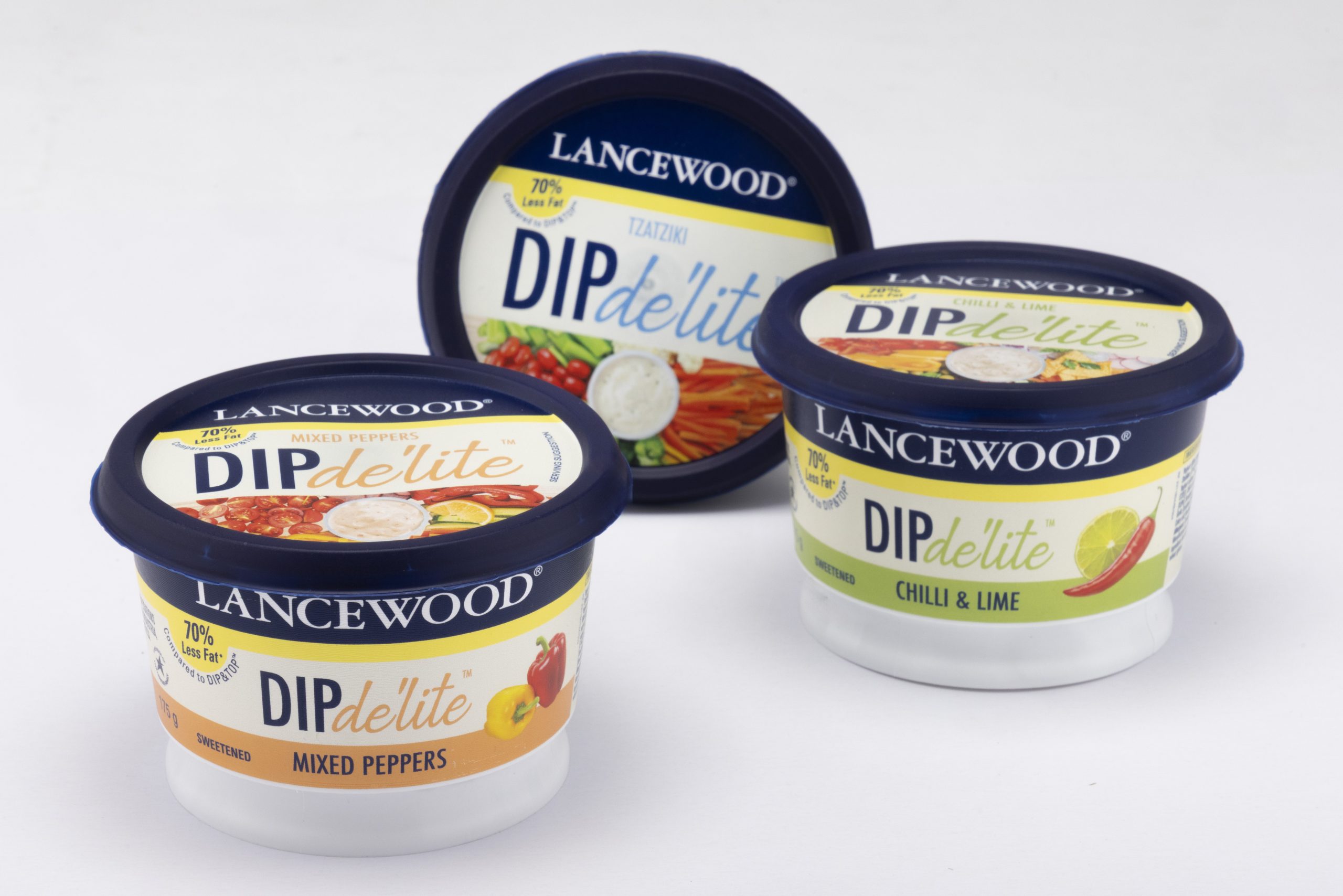
DIP de’lite needed to stand out in a crowded fridge filled with visual noise. Our solution was a clean, modern design system that balances white space with bold typography, allowing flavour names and product benefits to take center stage. A restrained palette with vibrant flavour cues makes it easy for consumers to distinguish between variants quickly—whether they’re shopping in-store or reaching into a home fridge.
Visual Hierarchy That Drives Selection
We focused on creating a clear visual hierarchy: brand first, flavour second, and benefit third. The Lancewood logo anchors the top of the pack, reinforcing trust and familiarity. Just below, oversized flavour names in confident sans-serif type create strong shelf readability.
Freshness Through Colour and Simplicity
Each variant in the range features a bold colour block or icon associated with its core ingredient—such as chives, peppers, or cucumber—adding immediate recognition and freshness cues. The use of clean backgrounds and subtle textures enhances the sense of quality.
Form Meets Function
Beyond the aesthetics, we considered practical factors like fridge visibility, on-shelf blocking, and product usability. The round tub format, paired with a consistent visual system across the range, creates strong brand blocking in the chilled section—helping the product stand out as a cohesive family while making individual flavours easy to spot.
A Fresh Take on Healthy Indulgence
DIP de’lite isn’t just about taste—it’s about smarter snacking. Our design reflects that ethos by balancing indulgent appeal with clean-living cues. It’s fresh, honest, and versatile—just like the product.
