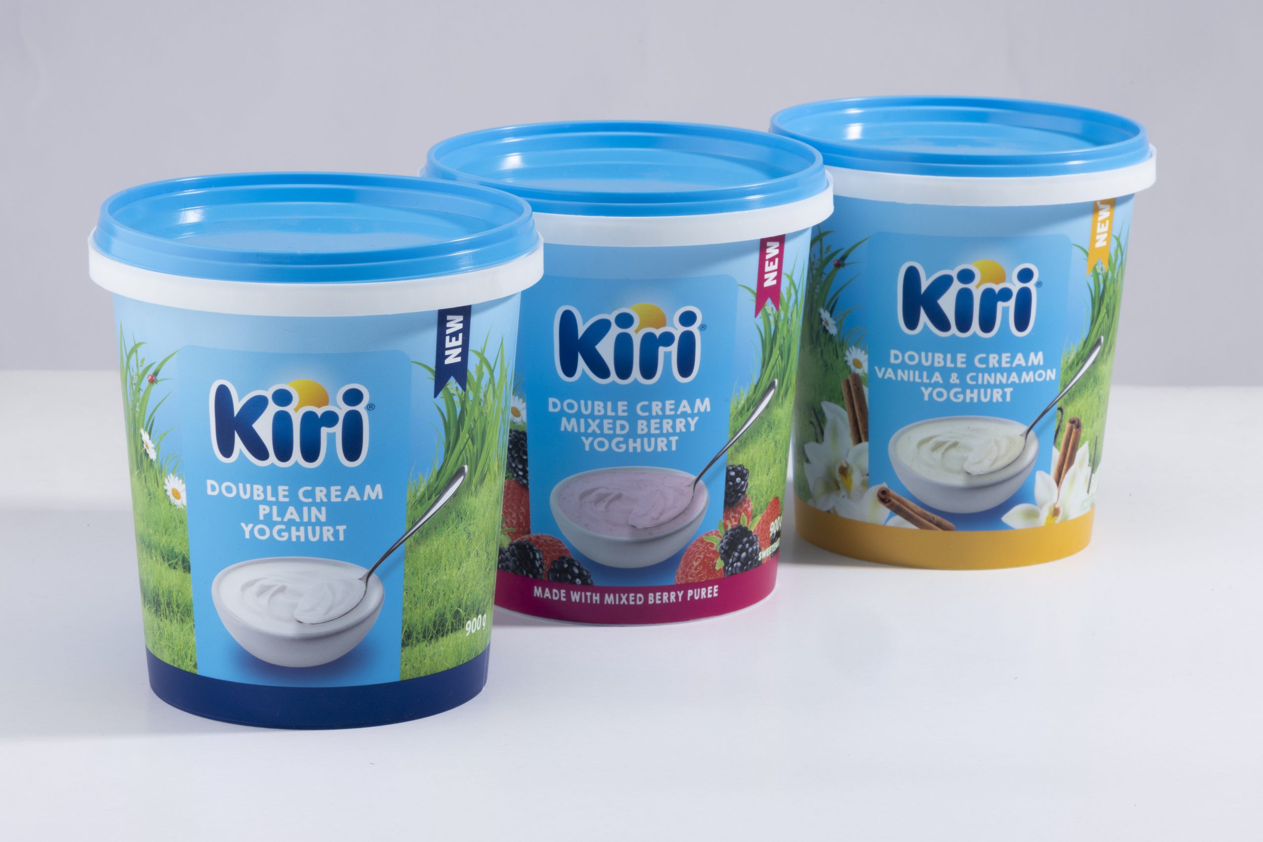
When global dairy brand expanded its presence in the South African market with a newDouble Cream Yoghurt ran ge, they turned to Bravo Design to translate product richness into a packaging system that’s bright, honest, and built to win on shelf.
Our task? Develop a look that’s friendly and familiar, but still premium—bridging Kiri’s global identity with local flavour preferences and on-shelf dynamics.
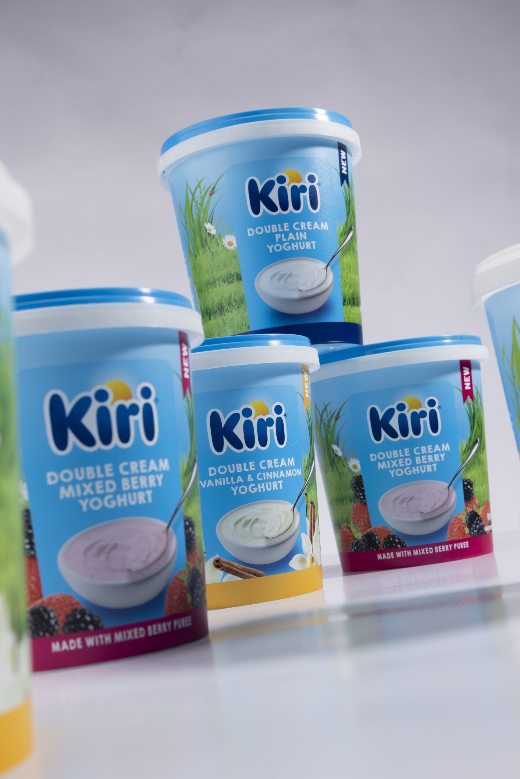
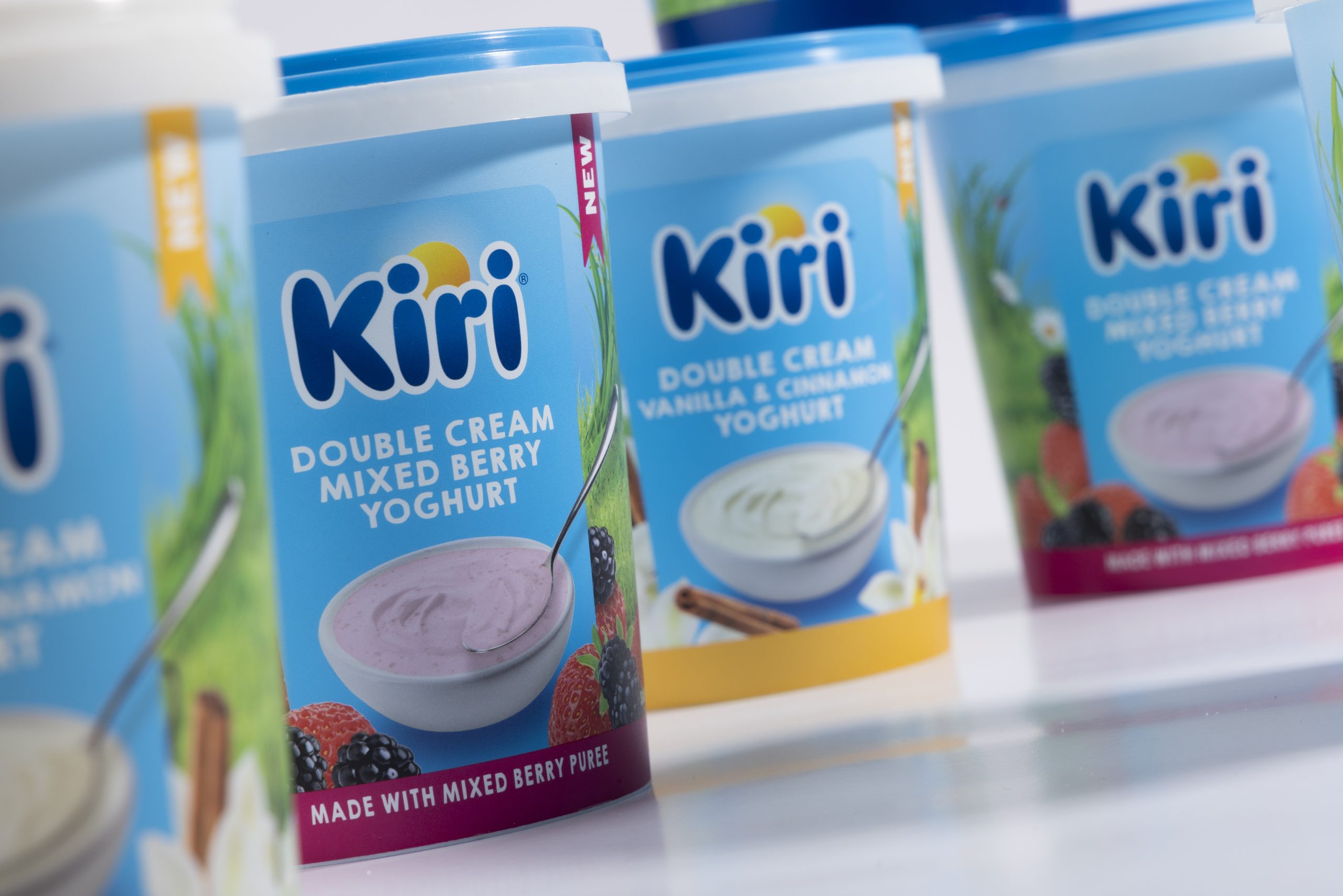
The Kiri Double Cream Yoghurt range was designed to deliver immediate flavour cues and strong fridge visibility. We combined a vivid colour palette, clear product visuals, and ingredient-driven storytelling to ensure the packs communicate indulgence without clutter. Each variant uses a distinct colour band for easy navigation, helping shoppers spot their favourites at a glance.
A rich blue masterbrand background anchors the range, complemented by natural textures like grass, herbs, and spices that convey freshness, flavour, and realness. Product bowls float on clean fields of green or blue, offering a fresh-from-the-fridge feel with minimal visual noise.
As a household name worldwide, the Kiri logo holds significant recognition. We preserved its integrity while building a packaging language that feels relevant to South African consumers. From Vanilla; Cinnamon to Mixed Berry and Plain, each SKU tells a subtle flavour story, reinforced by clean, inviting imagery and clear typography.
We also incorporated “NEW” indicators and strong front-of-pack claims (like “Double Cream”) to grab attention and drive trial—particularly important in a competitive, innovation-driven yoghurt category.
Fridge packs need more than just great design—they need structural clarity. The upright 900g tubs gave us a canvas for vertical storytelling, brand blocking, and colour banding that works at every shopper angle. The result is a shelf presence that feels both familiar and exciting—reassuring existing fans while attracting new ones.


