BRAVO Design ‘enters the unknown’ with unique ceramic bottles to showcase artisanal Cape Saint Blaize gin
Bottling the feelings evoked by a landscape is no small feat – yet this was the brief given to BRAVO Design by Cape Saint Blaize distillery ahead of the launch of their series of gins. Drawing inspiration from the landscape of Mossel Bay and through extensive collaboration, the design process yielded a genuinely unique packaging that speaks to the brand’s values of authenticity and innovation.
The project
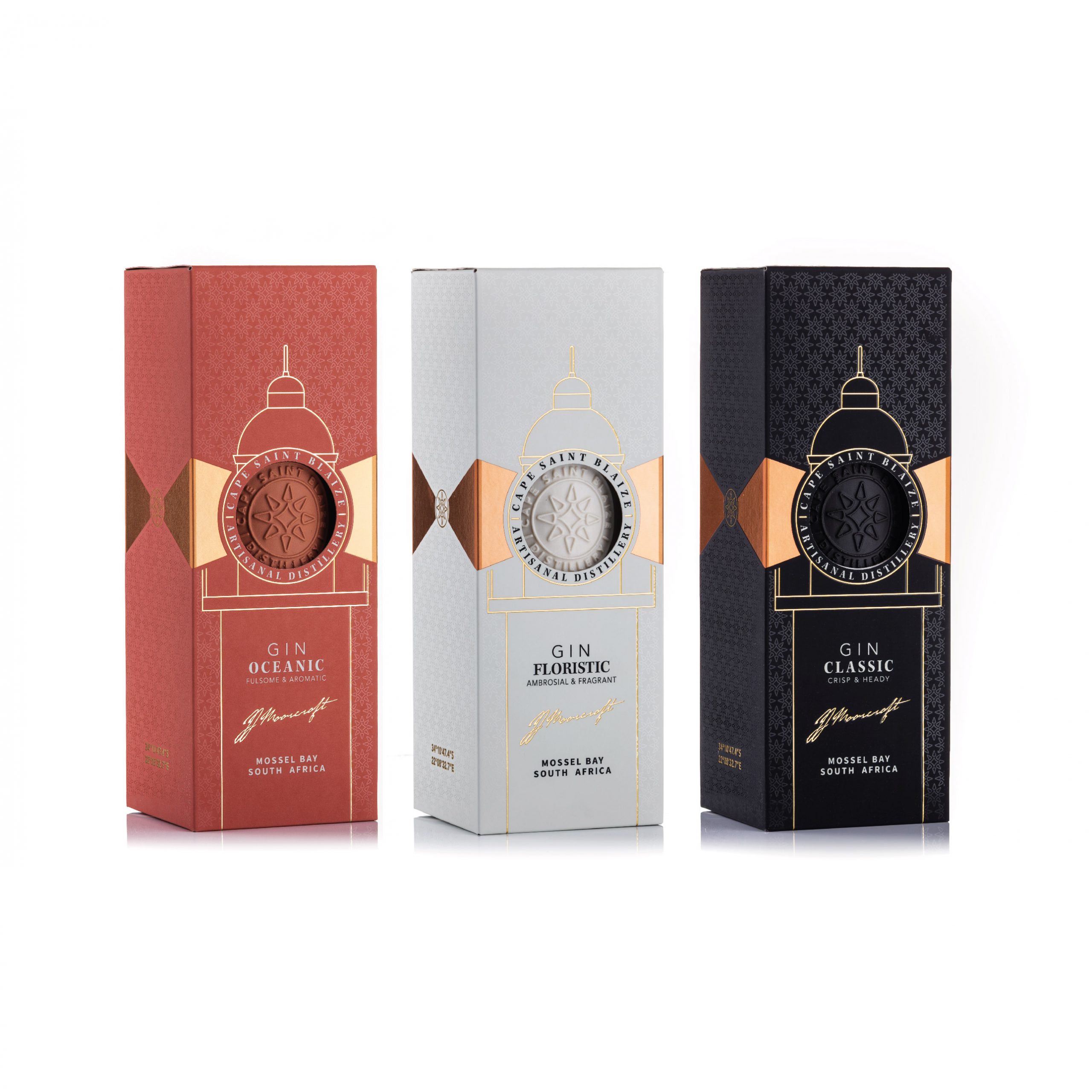
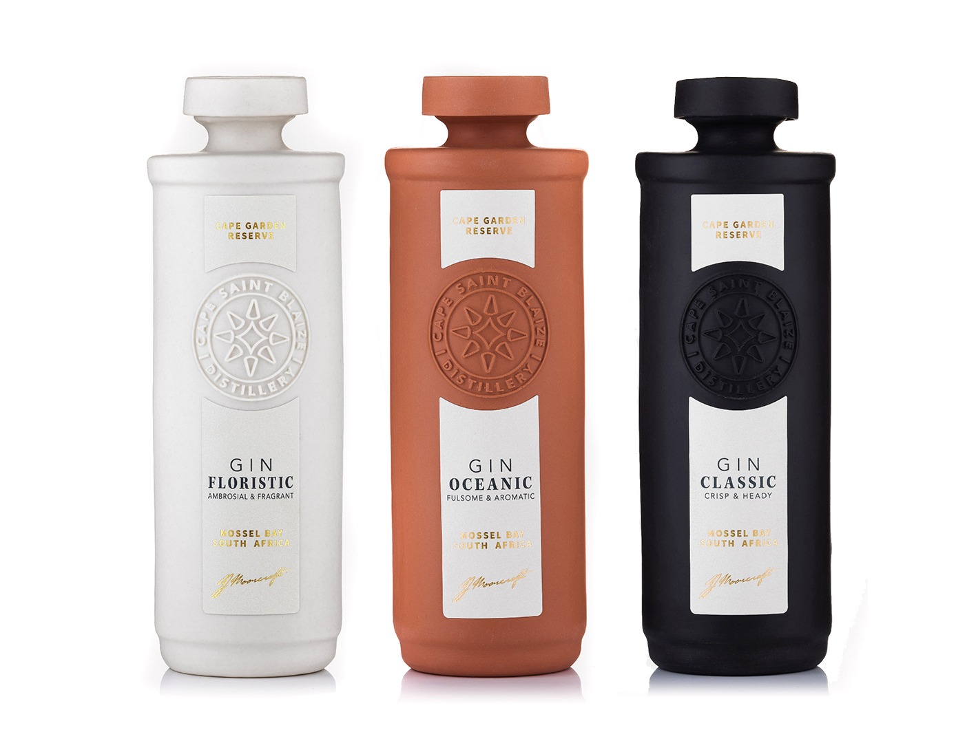
Cape Saint Blaize Distillery launched a range of gins – Classic, Floristic and Oceanic – and needed packaging that would stand apart in a highly competitive market while representing the distillery’s home of Mossel Bay.
The distillery captures the spirit of Eden through rare botanical selection and artful distillation. Each bottle is artfully distilled, bottled, and hand labelled as an ode to their home on the Garden Route.
The design team was instructed to take inspiration from the Cape Saint Blaize lighthouse, an icon on Mossel Bay’s coastline since 1864.
The square, white tower lighthouse stands on the cliffs of Saint Blaize, more than 20 metres above a cliff face, overlooking sandy beached and a rugged coastline responsibly for often dangerous and rough seas. The coastline has a rich heritage, with the lighthouse standing above a cave that houses some of South Africa’s first Middle Stone Age archaeological excavations.
Drawing inspiration from the natural landscape gave rise to the idea of a departure from the traditional trade glass bottles used by most distilleries. Instead, it led the design team towards working with natural materials that would create a tactile experience.
“We had to ask ourselves: ‘How do you bring a new gin to a highly competitive category and make it stand out?’,” says Brenden Schwartz, owner and creative director at BRAVO Design.
Solution
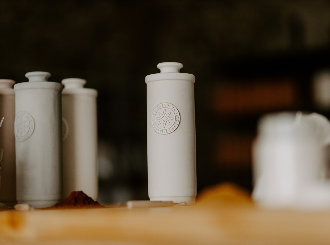
With the distillery open to exploring the alternative bottle, BRAVO Design began creating a unique, 360° packaging solution, that would pay homage to the brand’s ethos of creating handmade, artisanal products. The result was nothing short of inspiring, and totally unique to the SA market: a ceramic bottle representing the clean lines of the Cape Saint Blaize lighthouse and rugged coastline cliffs was to take centre stage, and would be offset with a clean design and high-quality labelling that embraced the distillery’s logo and complemented the ceramic. “It was important for the label not to compete, but to complement, the ceramic packaging,” says Schwartz.
It was a novel idea, and the team at BRAVO Design was delighted that the Cape Saint Blaize team was equally excited by the proposed direction: “The commitment and dedication of the Cape Saint Blaize team showed in their willingness to submit to the creative process,” said Schwartz.
“With committed clients, you can achieve anything even when entering the unknown. The unknown is the exiting space we like to work in, and our designers readily embraced the innovative ethos of the brand in creating something to push boundaries.”
Challenges
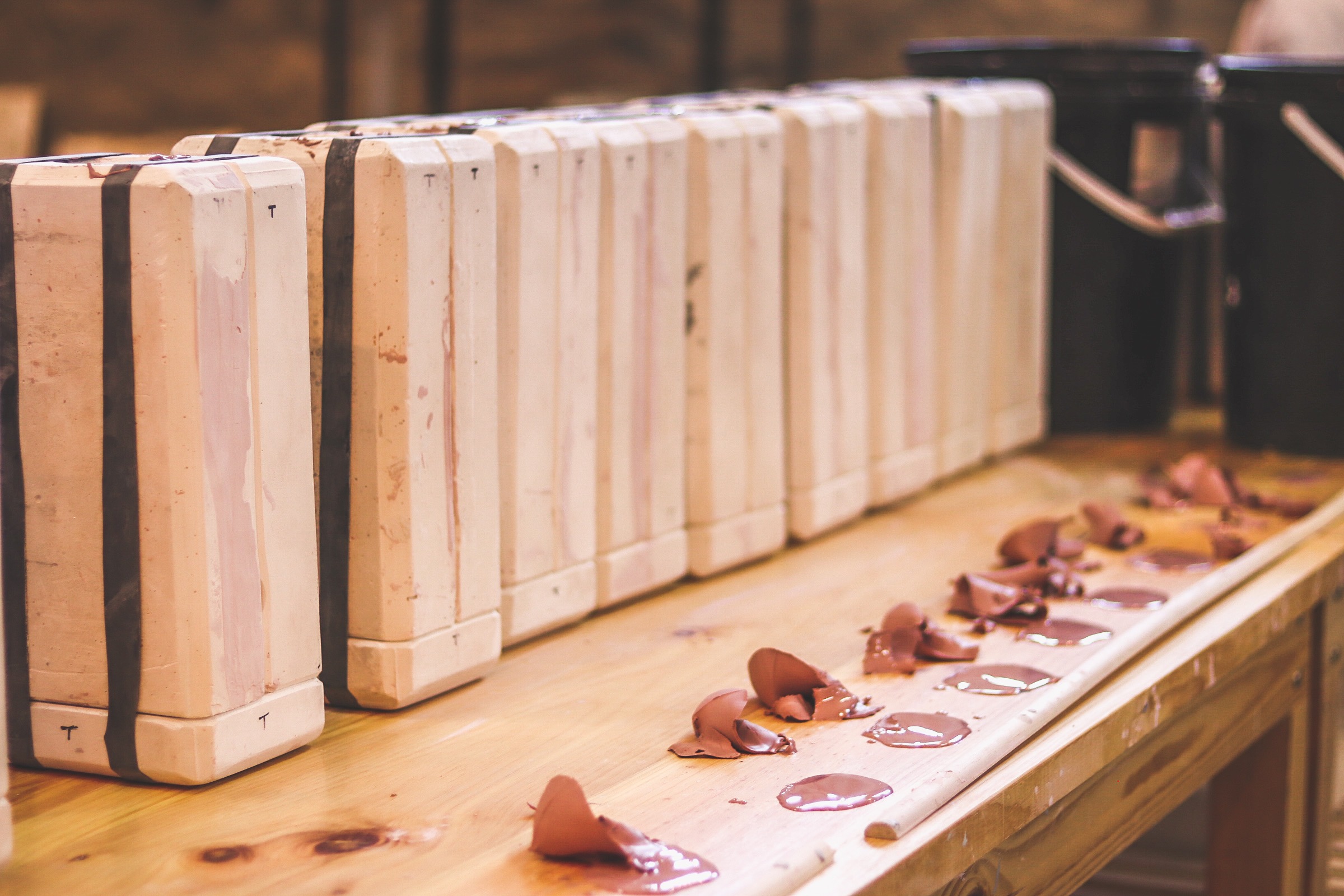
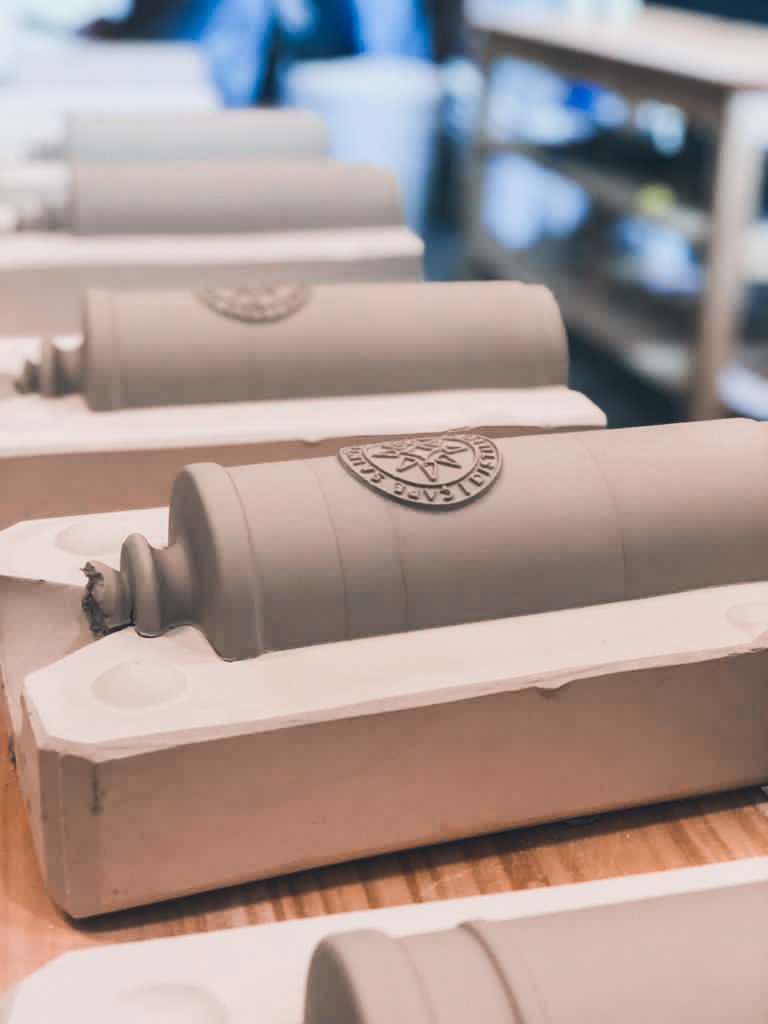
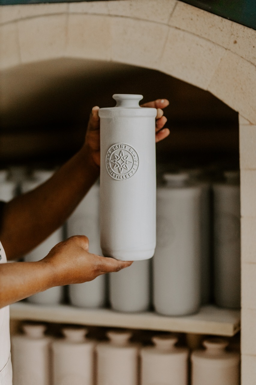
Creating a handcrafted ceramic bottle presented several challenges, which were taken on by a ceramic workshop alongside the distillery. The shape and form of the bottle evoke the historical lines of the Cape Saint Blaize lighthouse, but its production was a completely new experience for the design team.
There were many learning curves during the development process, with ceramicists having to account for the fact that the bottles both shrink and straighten as they dry, taking on a different shape to that moulded. The bottles were finally made of porcelain after experimentation with different clays.
“This is the secret to the design’s success. It’s an innovation from the ground up. None of us had ever worked with a ceramic bottle, and it took a collaboration with very skilled people from different fields to execute the design,” says Schwartz.
“In the end we achieved balance between the bottle, the brand icon and the label. On the surface, or at first glance, the packaging appears, clean and minimalist, exactly like we intended, But while a minimalistic design often looks simple on the finished project, it’s far from easy to achieve,” reveals Schwartz, adding, “the fewer elements you have, the more you have to pay attention to every detail. Just one mistake will show up clearly.”
Result
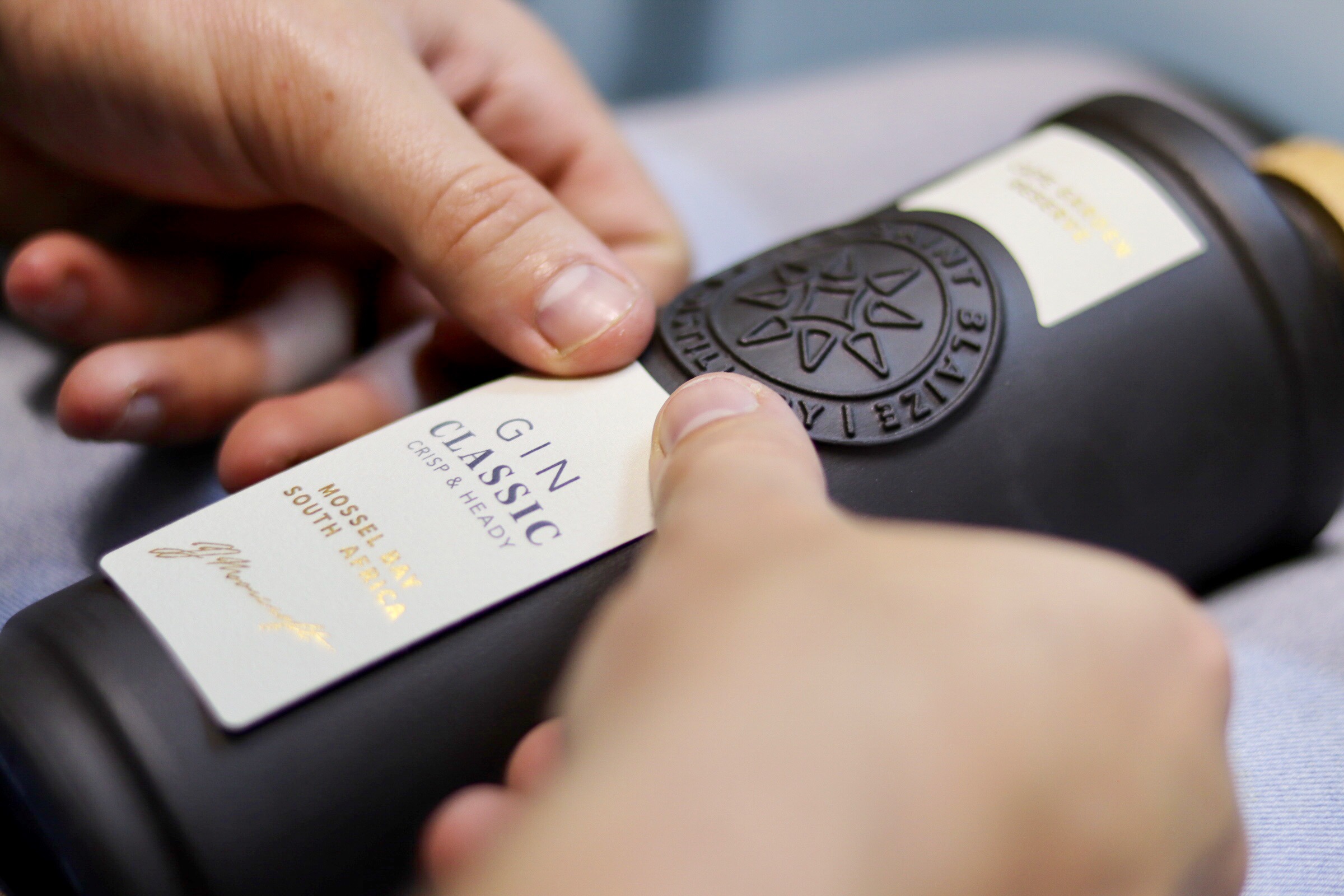
The result is a beautifully balanced design of handcrafted porcelain bottles and distinctive brand iconography that ensures the brand engages all the senses. On a thick, natural paper, the label embraces the Cape Saint Blaize logo and emphasizes the ceramic design – created in three colours for each gin variant. The attention to detail in the final product is evident throughout – from the ceramic bottle cast on-site at the distillery to the hand-applied label and wooden stopper.
Through collaboration, the team at BRAVO Design created a piece of art that you can take home. “People fall in love with the brand before they’ve even tasted it because they are drawn to the feeling the bottle evokes when they see it on the shelf. We’ve created a packaging that is both intriguing and beautiful, and that stands out in a highly competitive category,” says Schwartz
Besides drawing the consumer into the brand story, the packaging speaks to the brand’s commitment and dedication to create an artisanal product.
“It’s about moving away from creating just packaging. The Cape Saint Blaize team is offering customers something that few brands do – they offer something truly artisanal, something that’s unique and beautiful. The whole process allows for small batches of gin to be created, ensuring a quality that mass-produced offerings can’t mimic.”
Delivering unique design
“This was a very unique and original project,” says Schwartz. “Despite working with hundreds of brands over the last few years, this project held so many firsts for us and will definitely remain a standout collaboration in years to come. But what really sets the project apart is the Cape Saint Blaize team’s commitment to innovation. They fully embraced the co-creation between client and designer, and it delivered a truly unique product that stands out from its competitors.”
Also featured on The Best Packaging Designs by DesignRush
