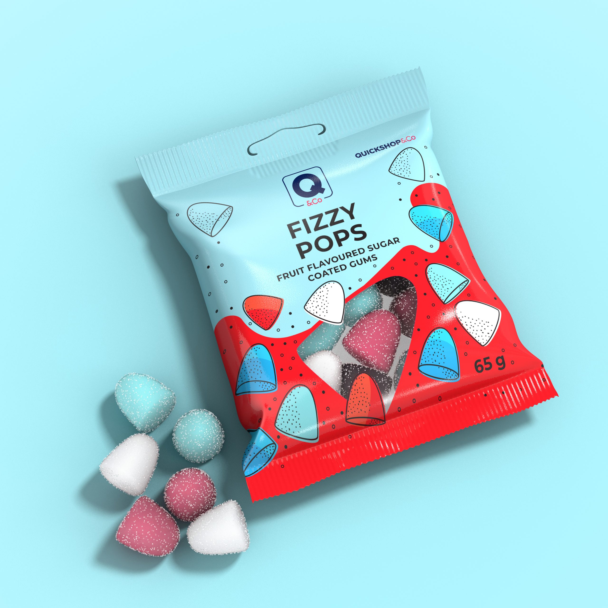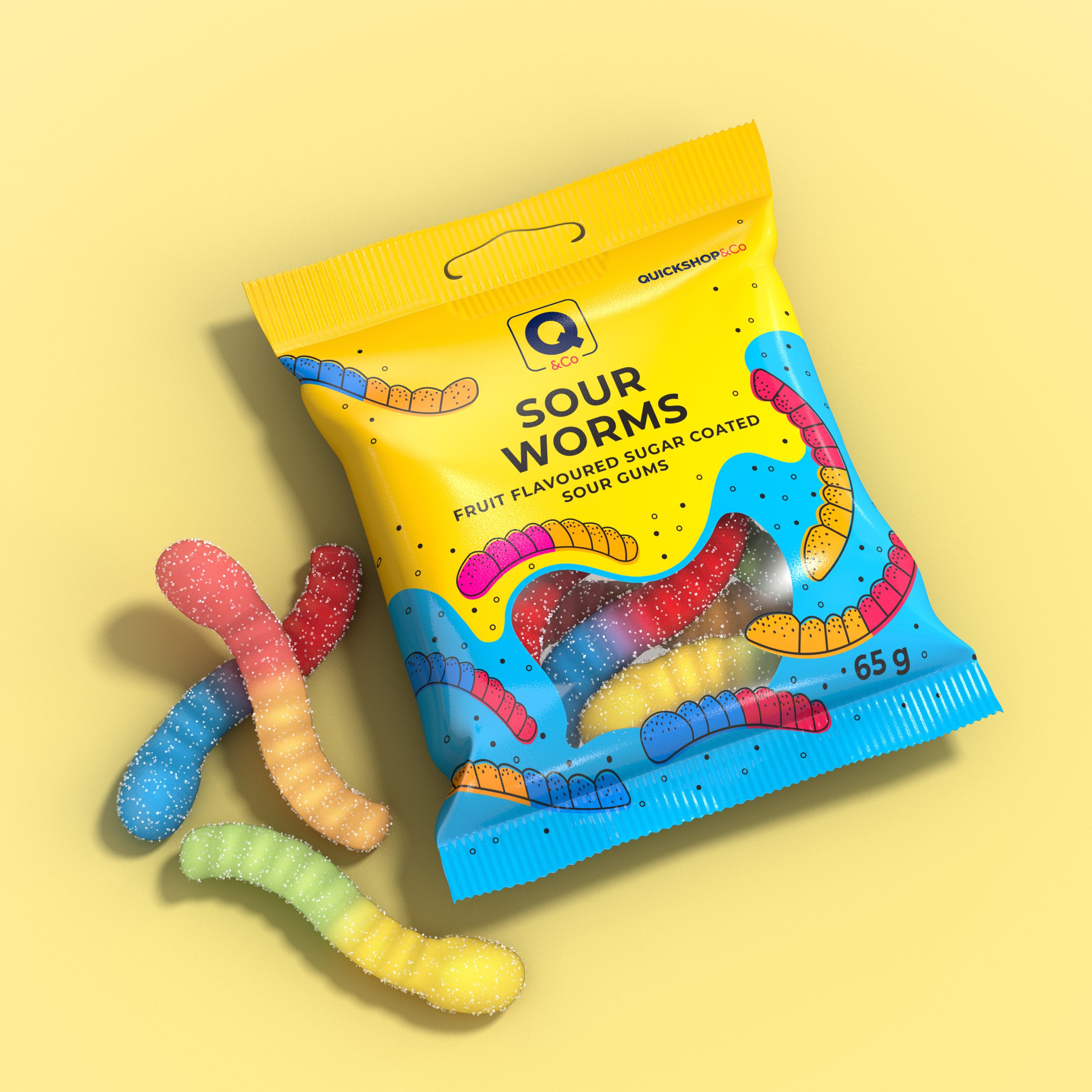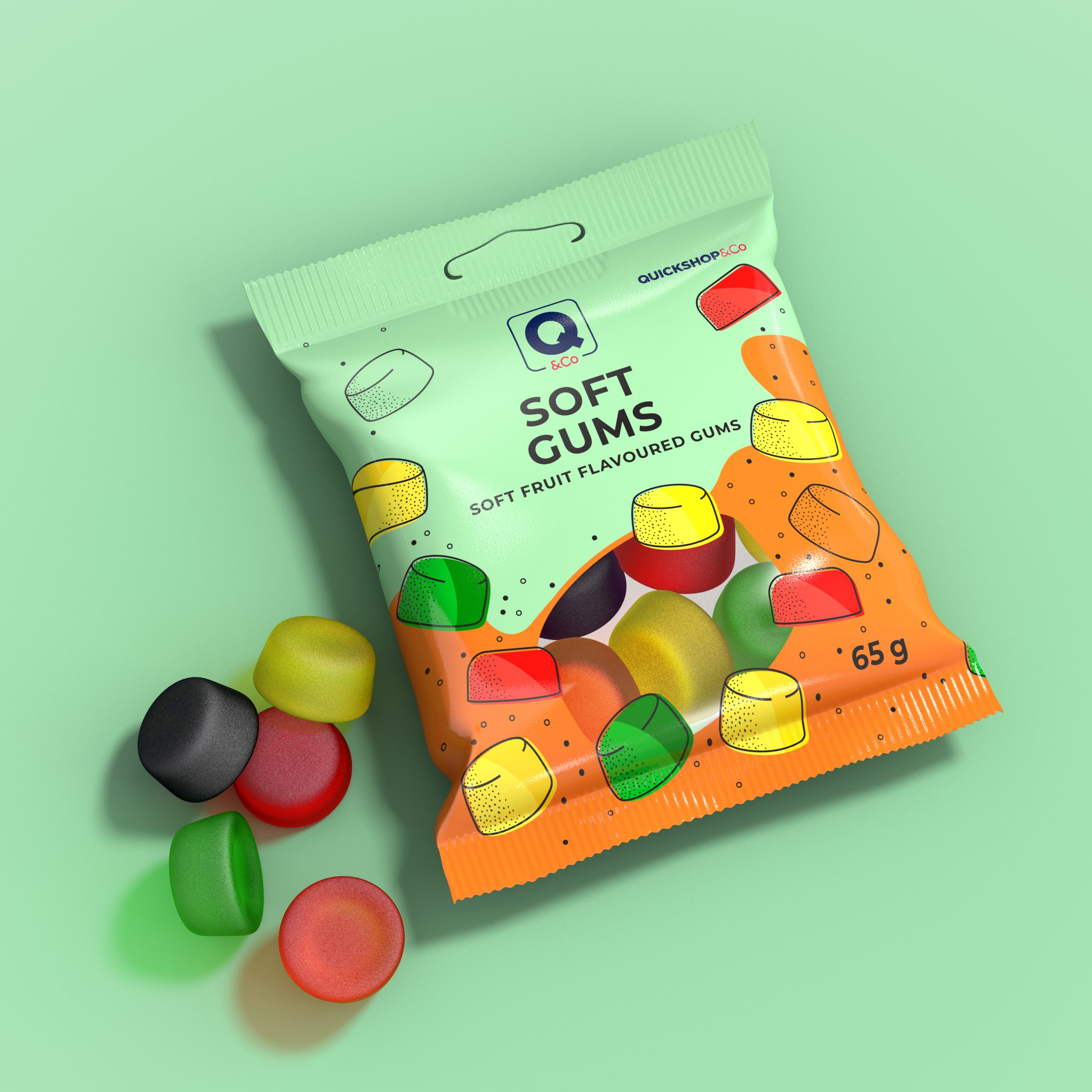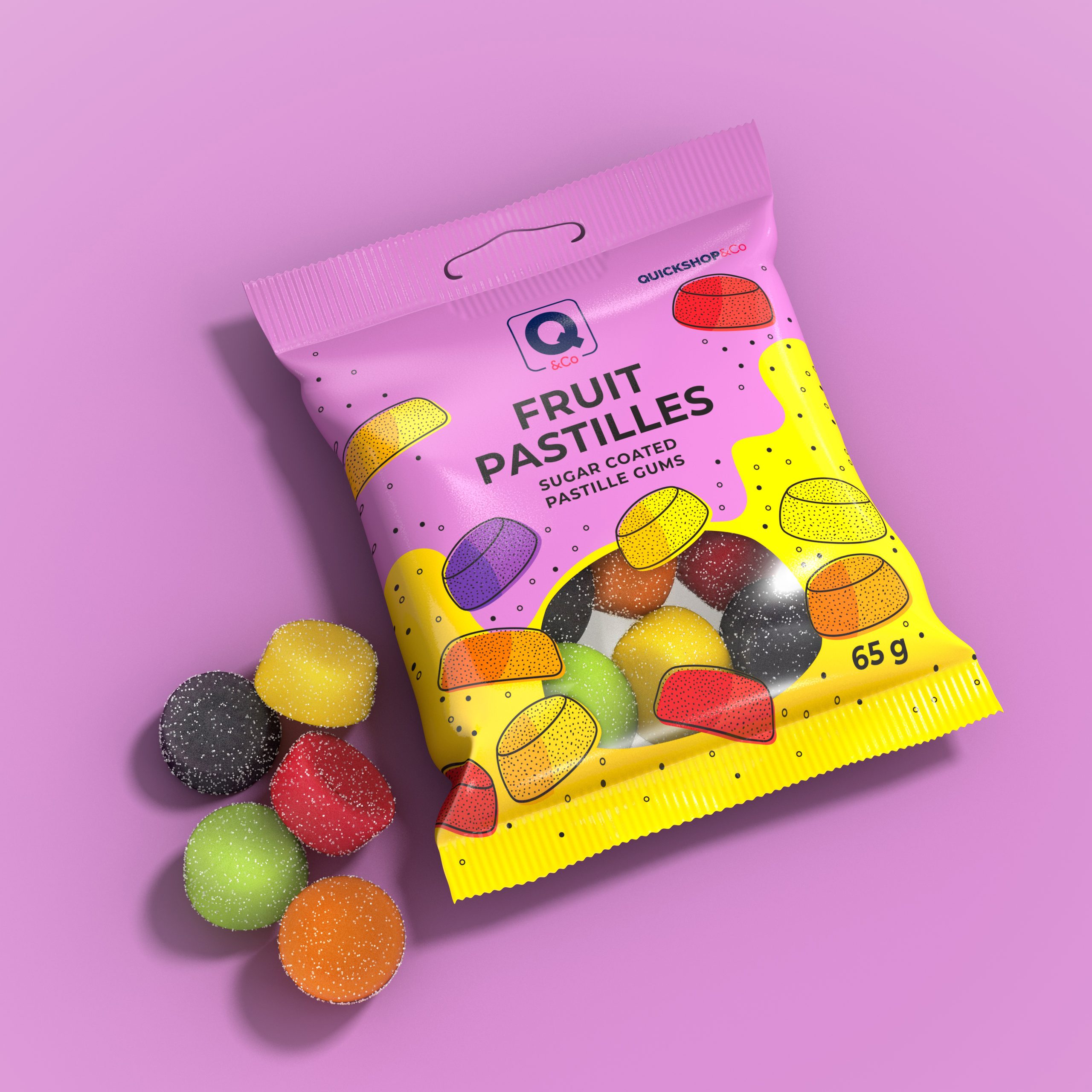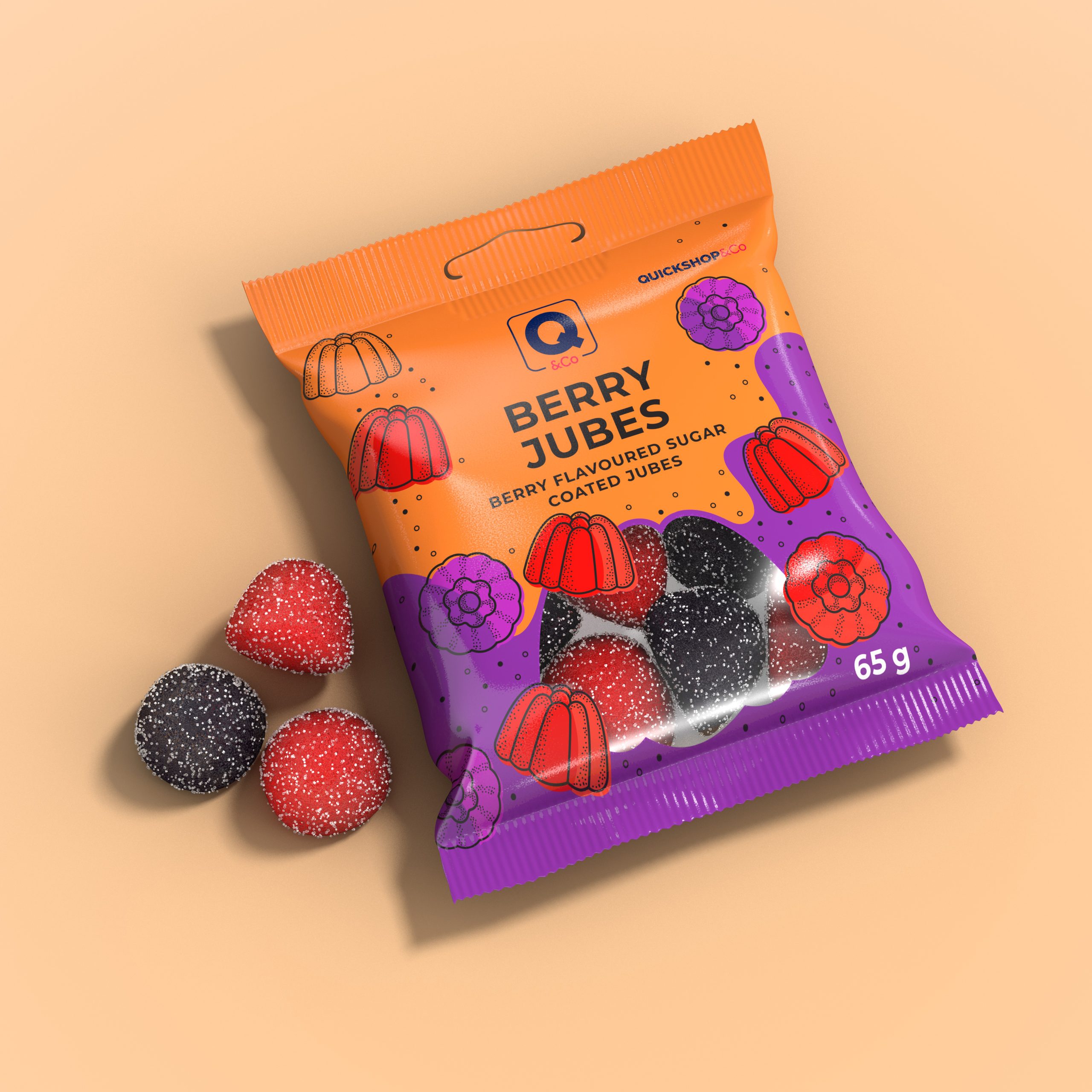
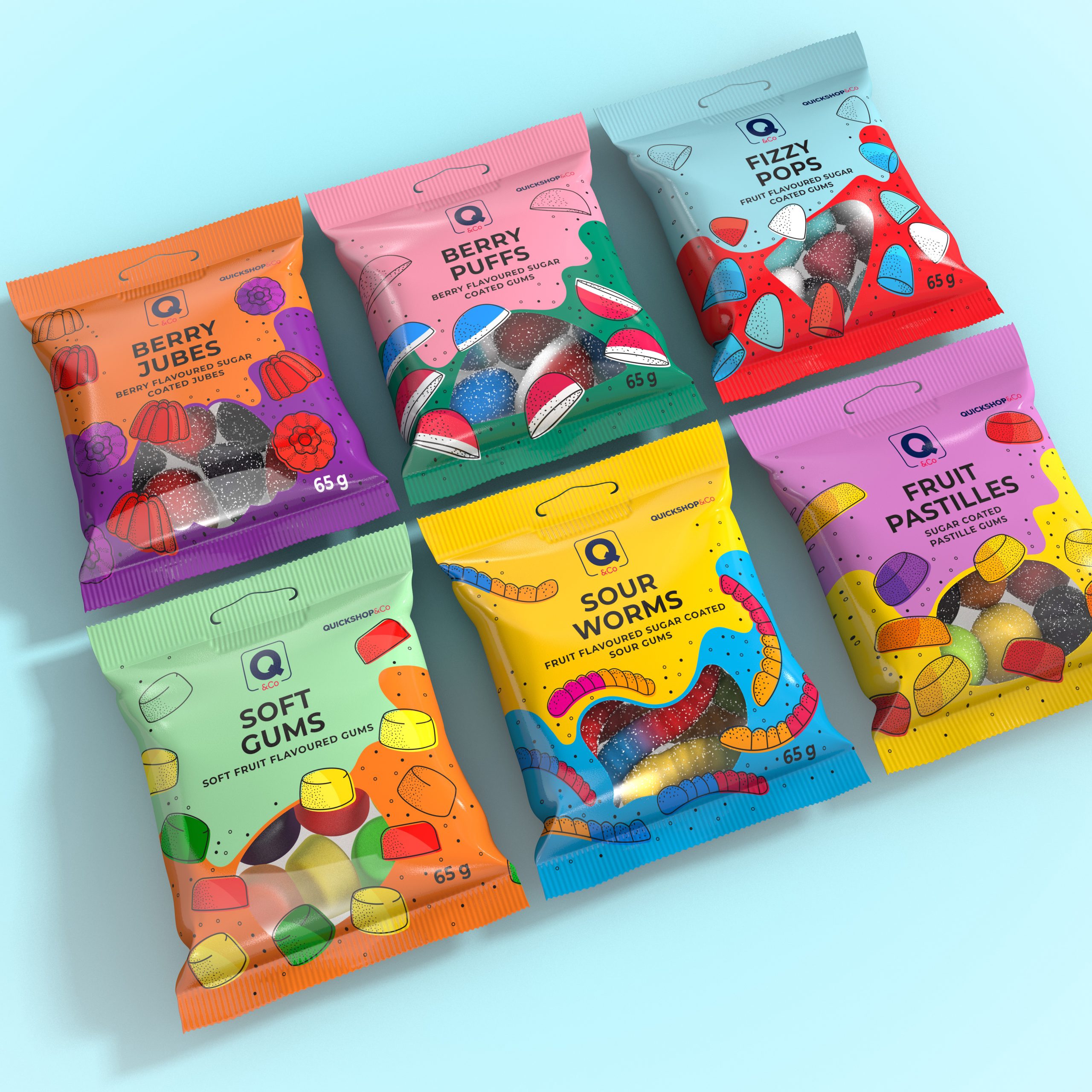
When Engen asked Bravo Design to design retail packaging for in-store sweets range, the goal was clear: design a visual identity that grabs attention, appeals to impulse buyers, and reflects the product’s playful spirit—without losing the Engen brand’s familiar feel. The result is a bold, vibrant range that blends creative design with smart retail strategy, delivering real shelf impact.
With only seconds to catch a shopper’s eye, the QShop sweets range had to be instantly visible. We used bold, high-contrast colour palettes and full-illustrative designs to make sure each pack stands out. Every detail was crafted to attract, engage, and convert casual browsers into confident buyers. It’s packaging that sells—without saying a word.
To bring more personality to the shelf, we created unique illustrations for every sweet variant. These fun characters give the range a playful, friendly feel that younger shoppers love. The illustrations also help build quick product recognition and set the range apart from generic alternatives.
Colour played a key role in the design. Each pack was colour-coded to show flavour, help shoppers make quick decisions, and build long-term brand recognition. This consistent use of bright, targeted colour improves visibility and helps turn interest into action.
QShop is exclusive to Engen stores, so it needed to feel exciting and new—while still fitting the trusted Engen identity. Our solution was a clean, cohesive packaging system that balances fun and familiarity. The final result is a strong in-store sub-brand that delivers visual energy, brand clarity, and shopper appeal.
